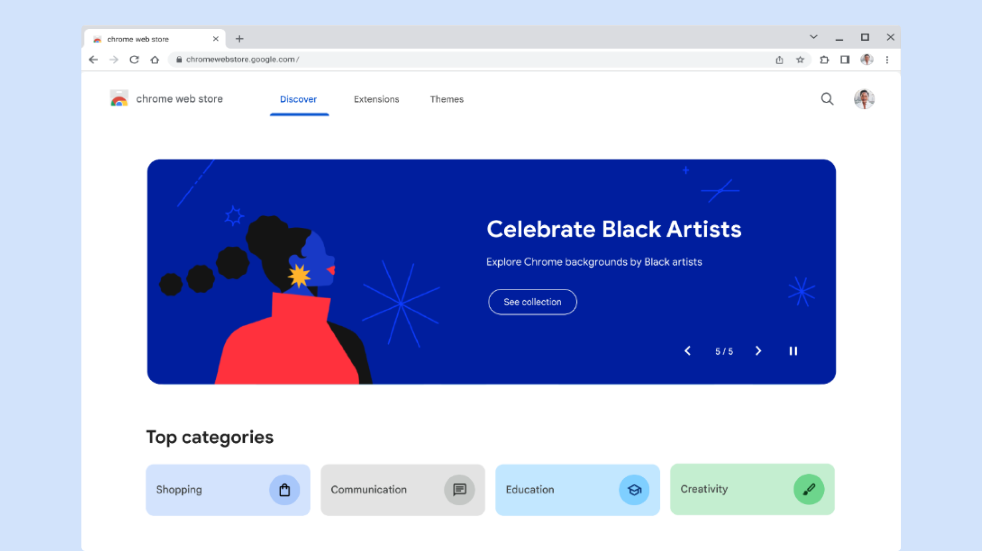
In celebration of Chrome’s 15th birthday, we’re thrilled to introduce the redesigned Chrome Web Store. With a user-centric focus, we’ve made it easier for you to search and find fun themes and helpful extensions to stay productive at home or at work. Let’s go behind the scenes and learn more about this redesign from Chrome Product Manager Hafsah Ismail and UX Designer Crystal Wang.
What influenced your decision to redesign the Chrome Web Store?
Hafsah: Chrome and the Web have evolved in remarkable ways. We now have extensions that unlock uncharted levels of productivity for developers or harness the power of generative AI to reshape work as we know it. It only felt natural to evolve the store to continue to meet the dynamic needs of users and developers in our ecosystem. Extensions and themes lie at the heart of a personalized Chrome experience, so it was a natural progression to give the store a fresh, contemporary look to align with this transformation.
Can you share more details about the design?
Crystal: This project was an amazing opportunity to redesign everything from the ground up, and was a collaborative team effort with product, research, writing, and more. Our main goals were to modernize the UI and create a well-lit path for users to find high quality extensions and themes to make the web work better for them. Two key areas of the design I’m particularly proud of are the refreshed look and feel and global navigation and search.
Seamless, global navigation and search
We updated the navigation and search experience to be seamless, universal and easily accessible, no matter where the user is in their extension discovery journey.
New categories based on user needs and lifestyle
Extension and theme categories were revamped to be more expansive, relevant, and focused on usefulness and purpose.
Modern and expressive look & feel
The redesign was an exciting opportunity to modernize the UI with Google’s latest design system, Material 3, allowing for a more modern, consistent and intuitive user experience. We also created brand new illustrations to help users connect with extensions on a more meaningful level; differentiating us from any other extension store on the market.
What’s new in the Chrome Web Store for developers?
Hafsah: Amplifying our developers is a critical part of our storefront’s redesign. We’re introducing a self-nomination form for developers to showcase their extensions for a spot in our Editor’s Picks collection. We’re eager to highlight extensions that:
-
Have a high-quality listing including visually appealing assets
-
Provide clear value to the user, and add to their Chrome experience
-
Are from a range of developers, big and small!
Please feel free to check out our developer post for more information and as a place for feedback from the community.
What are some of your favorite recent additions to store?
Hafsah:
-
Instapaper: I’m passionate about tech and cooking, always eager to discover the newest innovations and curate articles and recipes. Instapaper has become an essential extension for me; its power lies in letting me save anything I want to revisit later, a tool you don’t realize you need until you do.
-
Noisli: As a product manager who finds herself in energizing meetings, I really value creating the perfect work environment for deep work and reflection. Extensions like Noisli are game-changers, enabling the perfect environment for focused work. With Noisli, I can curate the soundtrack to my productivity
Crystal:
-
Todoist for Chrome: I’m someone who loves being organized, and I’ve always been super big on writing physical checklists. Recently, I’ve been very into Todoist to make to-do lists in my Chrome browser, and this productivity extension has become a personal favorite.
-
Asian & Pacific Islander Artist Theme Series: Being an Asian American, I’m also a huge fan and extra proud of the Asian & Pacific Islander Artist Themes series created by our team. I currently have Crested Ibis installed on my browser and I love it!
Posted by Joshua Cruz, Communications Manager
Remember to like our facebook and our twitter @geekchrome.


