Chrome for Android and the forever UI
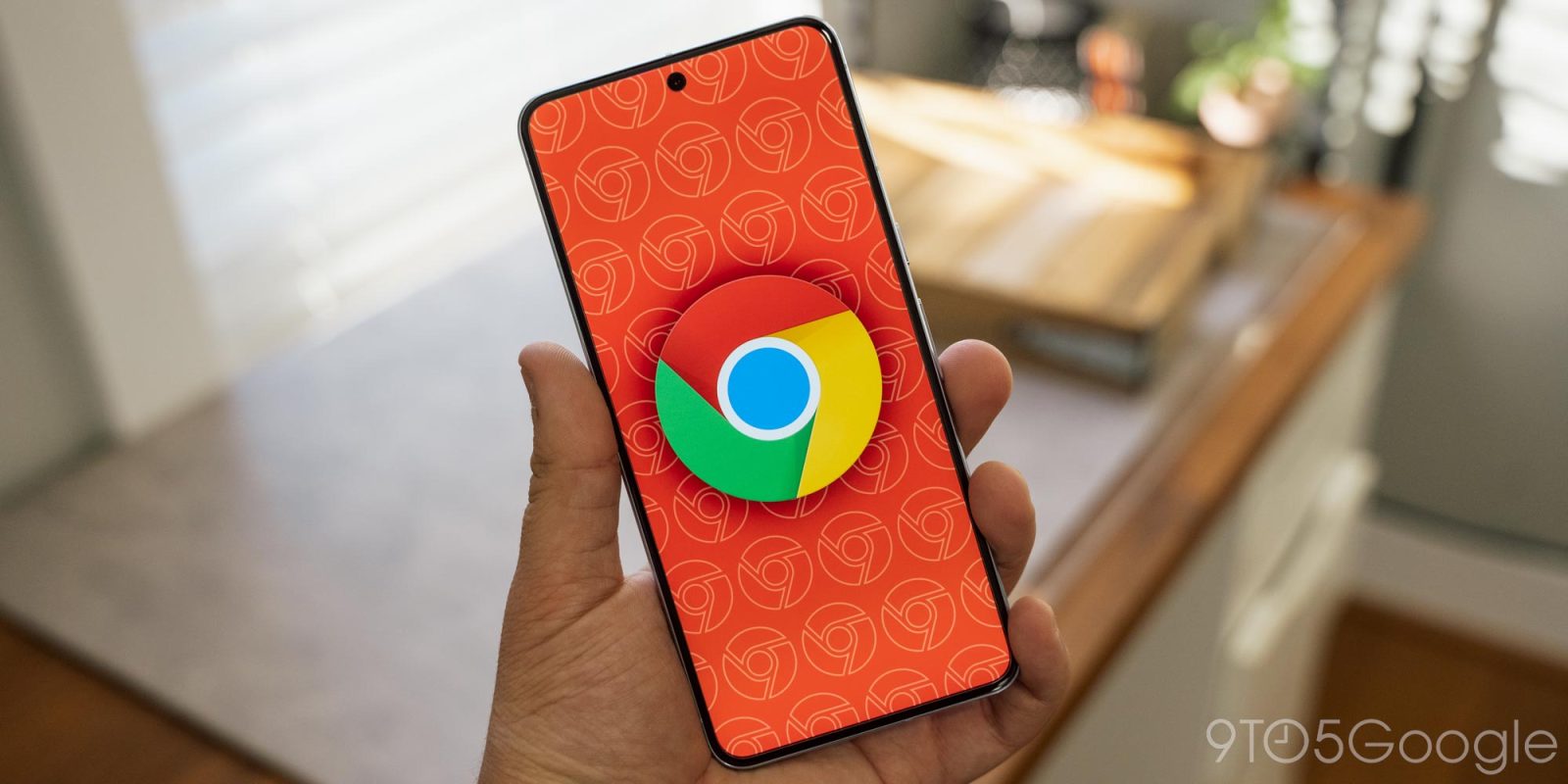
I like how Chrome for Android looks and works. When browsing, the primary interface is a pill-shaped address bar flanked by 2-4 buttons. While the design has been modernized and seen additions/removals over the years, it’s a layout that has been consistent since the app’s 2012 Android launch.
Remember to like our facebook and our twitter @geekchrome.
Discover more from Chrome Geek
Subscribe to get the latest posts sent to your email.

